A 72% Win Rate That Lies to You, and What It Taught Me About the 4 Levels of Data Analytics
Most explanations of data analytics stop at the definitions. Descriptive tells you about the past, predictive guesses the future, and so on. Tidy on a slide, but hollow until you attach it to data that actually exists.
So I used a dataset I control completely: the trade log of Lumera. Before we climb the four levels, it helps to know what Lumera is, because the whole case study rests on it.
What Lumera Is
Lumera is an automated paper-trading simulator for the Indonesian Stock Exchange (IDX). It runs on a schedule with no human at the wheel: every trading day it scans a universe of Indonesian stocks, looks for ones that are statistically oversold, buys them with virtual money, and later sells them according to fixed rules. The capital is fake (Rp 100 million per strategy), the market data is real, and nothing here is investment advice. You can watch it run live at palugadahub.com/lumera/mr.
Two things make Lumera unusually good raw material for a data-analytics case study.
First, it is honest by construction. It writes down every order, the price, the reason it entered, and the eventual profit or loss into a log. There is no hindsight editing. What the log says is what the system actually did.
Second, it does not just record. It learns. The system tags each trade with the conditions that produced it, tracks which conditions win, and then shifts its own behavior toward the ones that work. That means a single dataset from Lumera can climb all four levels of analytics at once, from merely seeing what happened all the way up to deciding what to do next.
Eighteen trades have now closed with real profit and loss. That is the dataset for everything below. The one rule: every claim comes from the actual numbers, never from a hypothetical.
Level 1 — Descriptive: What Happened?
Descriptive analytics is the first rung, and the most underrated. Without an honest description, the three levels above it are built on sand.
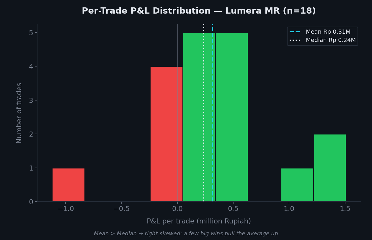
Of the 18 closed trades, Lumera won 13 and lost 5. A 72.2 percent win rate, with Rp 5.66 million in realized profit on Rp 100 million of virtual capital. So far it sounds great. But the number that actually tells the story is not the average, it is the shape of the distribution.
Notice the two lines on the chart. The mean (average) profit per trade is Rp 314,545, while the median (middle value) is only Rp 235,615. The mean sits higher than the median. This is not a coincidence, and it is the most important statistics lesson people routinely skip.
When the mean pulls itself above the median, the distribution is right-skewed. Meaning: most trades produce small to moderate wins, but a handful of large wins drag the average upward. The best trade returned Rp 1.51 million, while the median was one-sixth of that.
Why does this matter? Because if you only report "the average trade makes Rp 314 thousand", you hide the fact that the result leans on a few lucky trades. The standard deviation of P&L is Rp 569 thousand, nearly double the mean. The volatility is high. The honest description is not "this system profits steadily", it is "this system wins small often, wins big occasionally, and sometimes loses fairly deeply".
If the per-trade distribution describes the shape of the risk, the equity curve describes the journey.
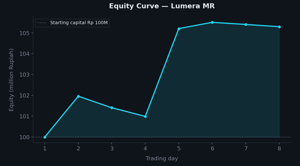
Up from Rp 100 million, but not in a straight line. There is a pullback partway through before it resumes. The equity curve is descriptive analytics in its most honest form: it does not hide the red days to flatter the green ending.
That is the job of descriptive analytics: not to make the data look good, but to make it look like what it is.
Level 2 — Diagnostic: Why Did It Happen?
Descriptive tells you what. Diagnostic asks why. This is where analysis comes alive, because we stop reading summaries and start dissecting causes.
Lumera records the reason for every entry, including the RSI at the moment it bought. RSI (Relative Strength Index) below 30 marks a stock as "oversold", sold off too hard, a candidate to bounce. The diagnostic question: do deeper-oversold entries produce better trades?
I split the trades by RSI at the time of purchase:
| Entry group | Count | Average P&L | Wins |
|---|---|---|---|
| Very deep RSI (≤22) | 2 | Rp 100,422 | 1 of 2 |
| Mildly oversold RSI (>22) | 16 | Rp 341,311 | 12 of 16 |
The result is counterintuitive. The most oversold entries were not the best ones. Trades entered at mildly oversold RSI produced roughly three times the average. This is an early signal that "cheaper is always better" does not hold, a stock that falls the deepest sometimes falls for a fundamental reason, not just a temporary technical dip.
The second diagnostic layer: how did these trades close? Of the 18 exits, 16 closed because price returned to the MA20 (reverted to the mean), only 1 hit take-profit and 1 hit cut-loss. This confirms the engine is doing exactly what it was designed to do, a mean-reversion strategy: buy when price strays far below its average, sell when it returns to normal. Not a momentum chase, not a hold-for-a-big-win.
Diagnostic analytics turns "we won 72 percent" into "we won 72 percent because we bought mild deviations from the mean and sold them on the bounce, not because we caught the deepest fallers". That difference is what lets us climb to the next rung.
Level 3 — Predictive: What Might Happen?
Predictive analytics uses past patterns to anticipate the future. The interesting part is that Lumera does not wait for a human to run a predictive model. It builds its own as it goes.
The system tags each setup with a fundamental-quality label. A Q setup means the stock has positive EPS (the company is profitable) and a reasonable PER under 25. A nonQ setup fails those tests. Then it records the outcome of each group:
| Setup | Count | Win rate | Average P&L |
|---|---|---|---|
mr|rsiShallow|Q|LONG | 3 | 67% | +Rp 84,590 |
mr|rsiShallow|nonQ|LONG | 1 | 0% | −Rp 139,951 |
The sample is still small, and that has to be said honestly, but the direction is clear and consistent with theory: an oversold stock with healthy fundamentals is a better buy at a discount than a fragile one. The healthy ones bounce, the fragile ones often keep falling.
This is the core of predictive analytics: from historical data (Q setups tend to win, nonQ tend to lose), the system forms an expectation for the next trade. When a fresh Q-labeled candidate appears, the model predicts a higher chance of winning. Not a certain forecast, but a shift in probability grounded in evidence, and that is what separates a prediction from a guess.
Level 4 — Prescriptive: What Should Be Done?
The highest rung. Descriptive sees, diagnostic understands, predictive anticipates. Prescriptive acts.
In most organizations, this fourth level ends as a recommendation in a report that may or may not get read. In Lumera, the prediction is translated straight into a rule that executes automatically. The system has a mechanism called a learned gate: as soon as the data shows Q setups are more profitable, capital allocation shifts toward them and nonQ setups are suppressed. No human presses a button.
This is a rare case where all four levels of analytics connect in a closed loop. The system collects data (descriptive), dissects the causes of winning and losing (diagnostic), estimates which setups will win (predictive), then adjusts its own decisions (prescriptive), then gathers new data from those decisions, and the loop turns again.
True prescriptive analytics is not about producing clever recommendations. It is about closing the gap between "we know what should be done" and "it actually got done".
From Four Levels to One Process
If you look closely, those four levels are really a compressed version of the longer data-analytics process. Every serious case study passes through the same stages:
Data collection. Lumera writes every order, price, reason, and outcome into a log. Without disciplined recording from the start, none of the analysis above would be possible.
Data cleaning. Before computing anything, I had to separate the 23 buy orders from the 18 sell orders, drop rows with no P&L, and match each sale to its purchase. Raw data is almost never ready to use.
Exploration. Looking at the spread, hunting for oddities, noticing that the mean and median are not equal. This stage is where the good questions come from.
Transformation. Turning raw RSI into "deep" and "mild" groups, converting rupiah into millions so the chart reads clearly. The shape of the data determines what you can see.
Analysis and modeling. Descriptive statistics, group-versus-group comparison, reading patterns from the system's own simple learning machine.
Visualization. One good distribution chart explains the concept of skewness faster than three paragraphs.
Decision. And in the end, all of this is only useful if it changes an action. In Lumera, it genuinely changes the action.
The four V's of big data (volume, velocity, variety, veracity) are often framed as large-scale challenges. But the same discipline applies to this 18-row dataset. What matters most is not the size of the data, it is veracity, honesty about what the numbers actually say. A 72 percent win rate sounds impressive until you see the result is right-skewed, propped up by a few large wins, with high volatility, and a sample that still needs to grow.
That is the real work of a data analyst. Not making numbers look impressive, but forcing the numbers to say the truth, and then turning that into better decisions.
The whole system, its live equity, open positions, and the strategies behind it, is public at palugadahub.com/lumera/mr. Every number in this article came from its own trade log.
Note: Lumera is a simulation with virtual capital, not investment advice (POJK 13/2025). The data used in this article is a real trade log from the system, but past results are no guarantee of future results. This article is about the method of data analysis, not an invitation to trade.
Building an AI agent?
I'm packaging how I ship them into one kit. Early access:
AI Agent Starter Kit →