25,062 Free-Meal Kitchens, Run Through the Full BI Stack. A Working Example of DIKW, OLAP, and the Analytics Maturity Ladder.
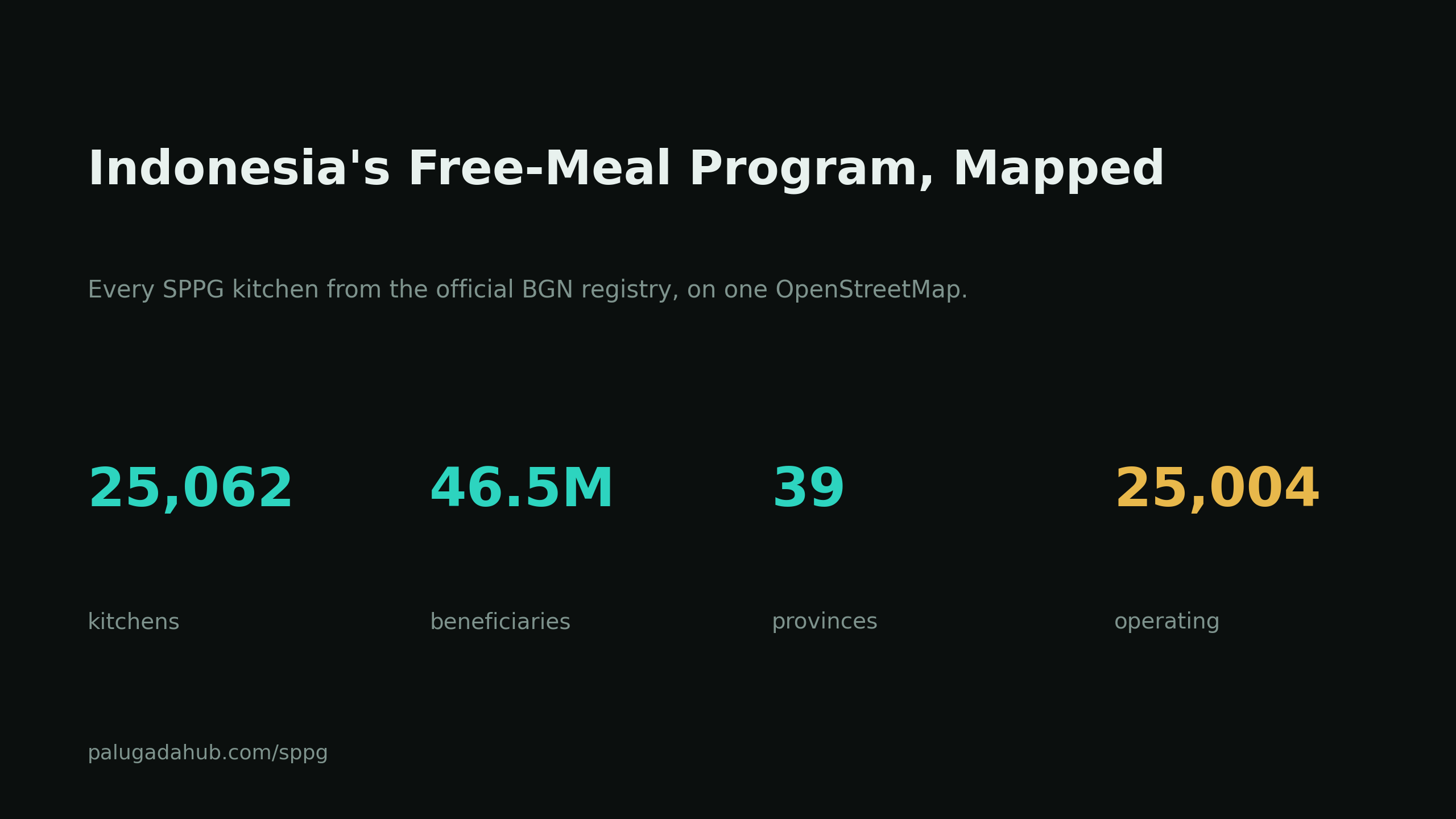
Business Intelligence is not one theory. It is a stack of them, borrowed from management science, information systems, and computer science. The cleanest way to understand the stack is to actually run a real dataset through it. So we took every kitchen in Indonesia's Free Nutritious Meal program (MBG), 25,062 of them from the official National Nutrition Agency registry, and climbed the whole ladder, from raw rows to a recommendation. Explore it live at palugadahub.com/sppg.
The frame for the whole piece is the DIKW hierarchy: Data becomes Information when you give it context, Information becomes Knowledge when you find the patterns, and Knowledge becomes Wisdom when it guides a decision. BI is the machine that lifts data up that pyramid. Here is each rung, with the actual numbers.
Data: the raw rows
The registry exposes one row per kitchen: an id, a name, latitude and longitude, an operational start date, a beneficiary count, a breakdown by education segment, and the administrative codes for province, kabupaten, and kecamatan. On its own, a row tells you nothing. 25,062 rows in a table is data, not insight. Everything below is the work of turning it into something a decision-maker can use.
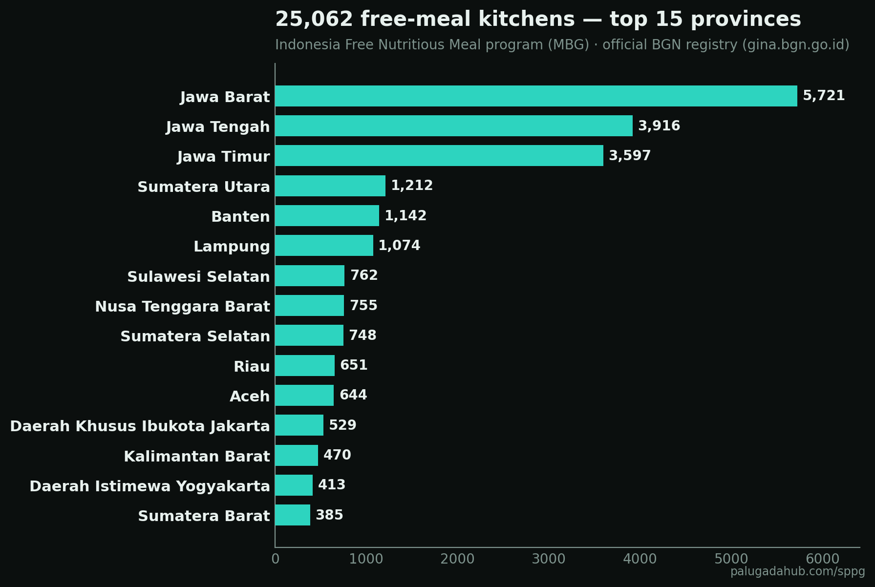
Information: descriptive layer, what and where
The first lift is descriptive. Count and group. The distribution is heavily Java-centric: West Java alone holds 5,721 kitchens, more than a fifth of the national total, and the three Java provinces together pass 13,000.
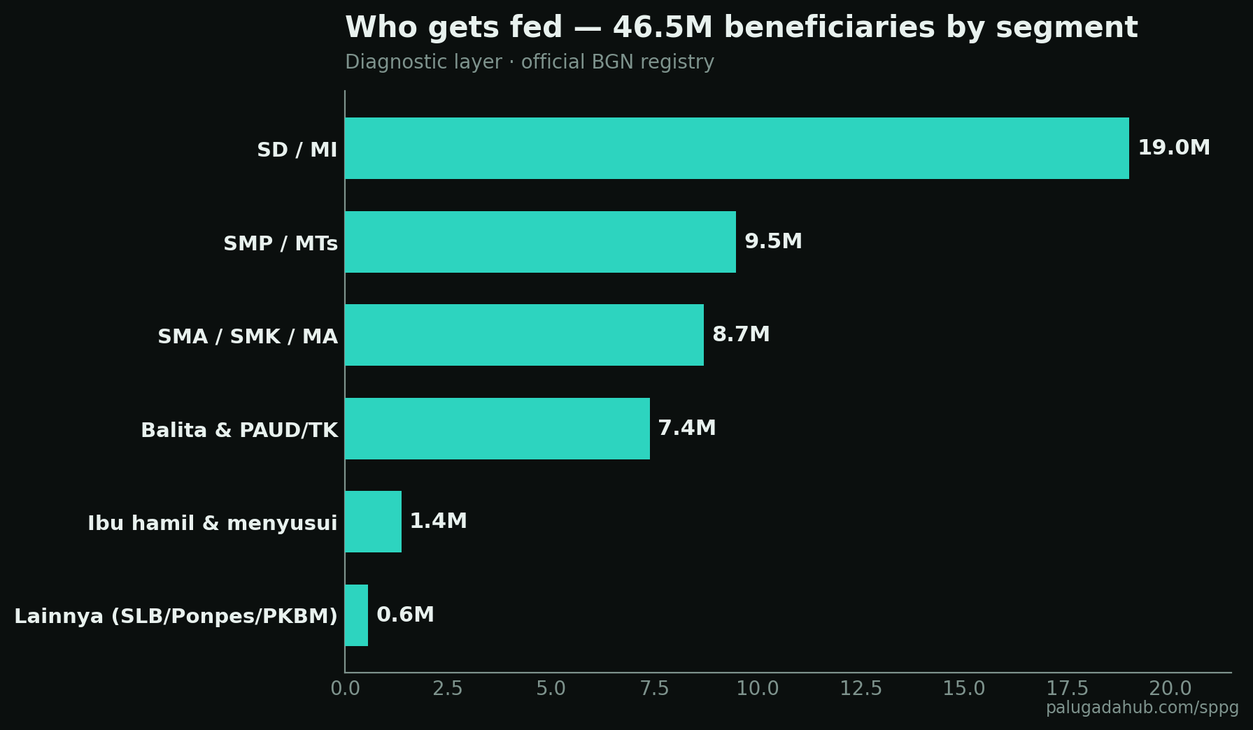
Then break the 46.5 million beneficiaries down by who they actually are. Primary school children dominate at roughly 19 million, more than the next two segments combined.
This is the OLAP idea in practice. Think of the data as a cube you can slice by province, dice by segment, and roll up or drill down through the administrative hierarchy. Rolling the 25,062 kitchens up into 499 kabupaten and ranking them shows where the program is densest on the ground.
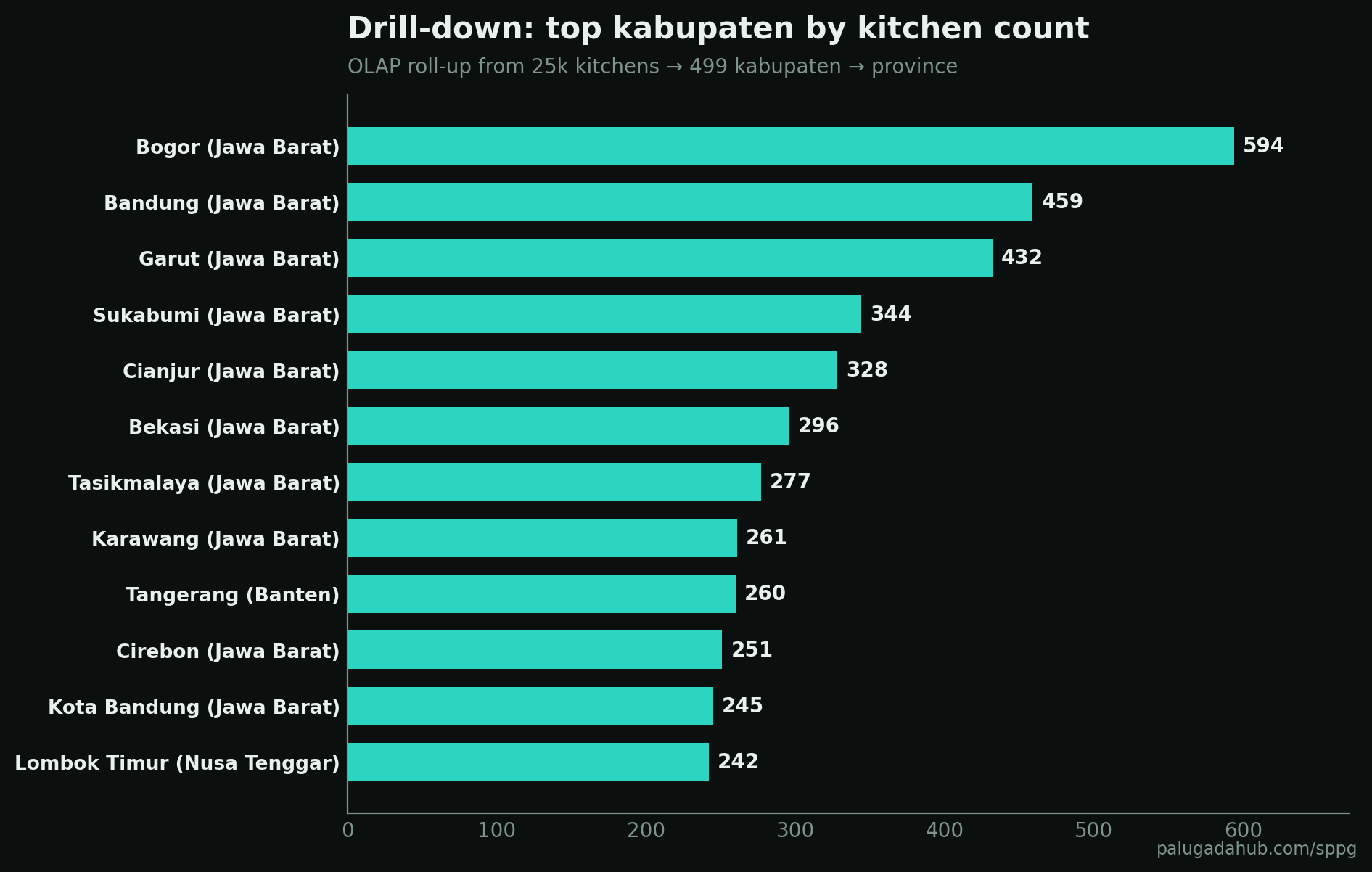
Bogor leads with 594 kitchens feeding over a million people. That is a province slice (West Java) drilled down one level to the kabupaten that carries the most weight inside it.
Knowledge: the trend layer
A single snapshot hides the story of how it happened. Add time. Each kitchen has an operational start date, so we can rebuild the rollout month by month.
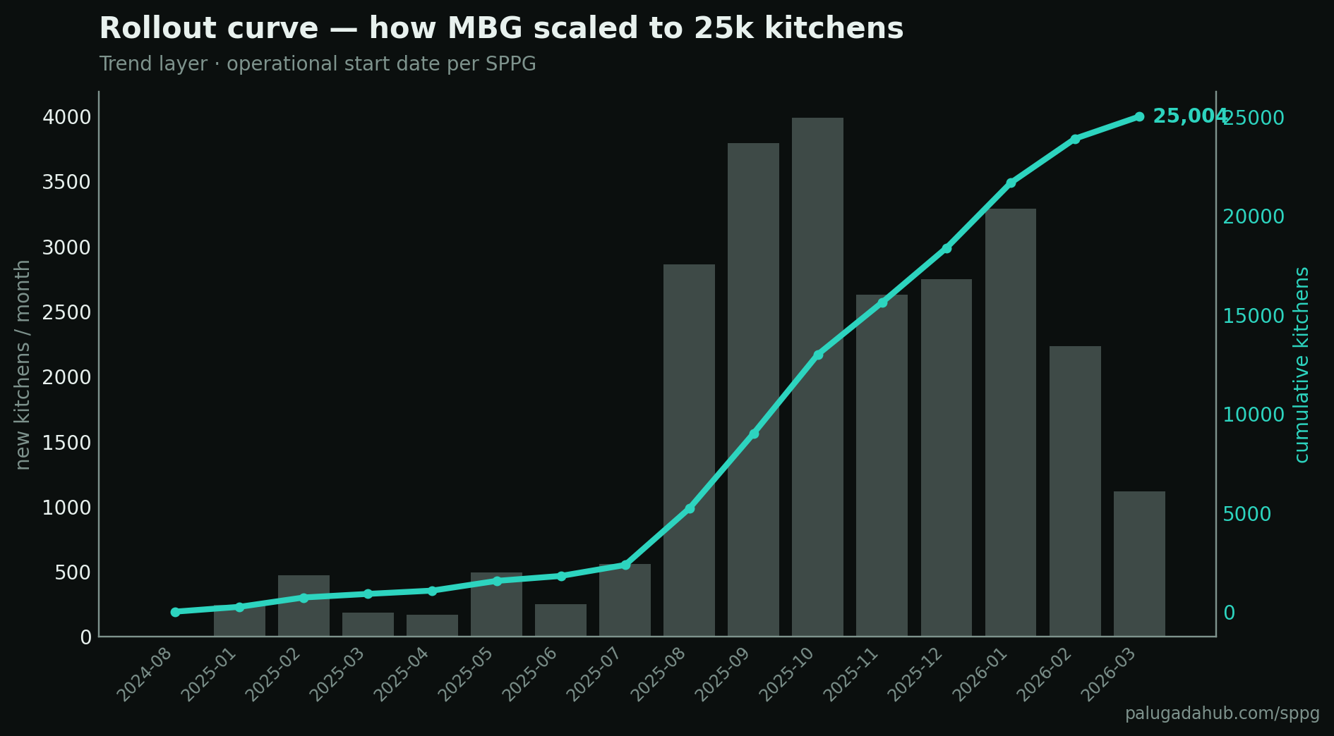
The shape is a classic S-curve. Almost nothing through 2024, a slow build in the first half of 2025, then an explosion from August 2025 onward where the program added 3,000 to 4,000 kitchens a month. The pace then cools in early 2026, which lines up with the public news that BGN paused new construction for budget efficiency. The trend turns a pile of dates into knowledge: this was a deliberate, front-loaded national sprint, not organic growth.
Knowledge: the diagnostic layer
Descriptive tells you what happened. Diagnostic asks why, and where the system is under stress. The sharpest diagnostic here is load: beneficiaries per kitchen, by province. The national average is around 1,850. Provinces well above it are stretched thin, those below have slack.
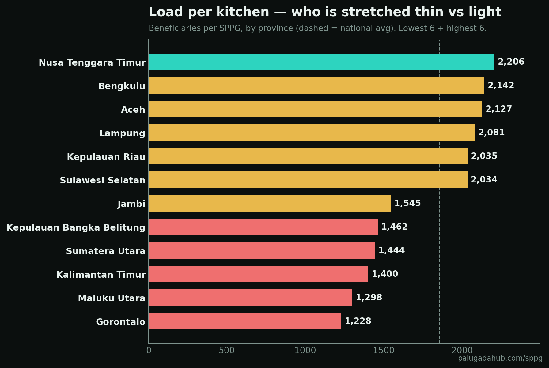
This is competitive intelligence turned inward. There is no competitor in a government program, so the benchmark becomes province against province. A province serving 2,500 people per kitchen is running a very different operation from one serving 1,000, and that gap should drive where the next kitchens and the next audits go.
The second diagnostic is uncomfortable. When we plotted all 25,062 points, nearly a fifth had coordinate problems.
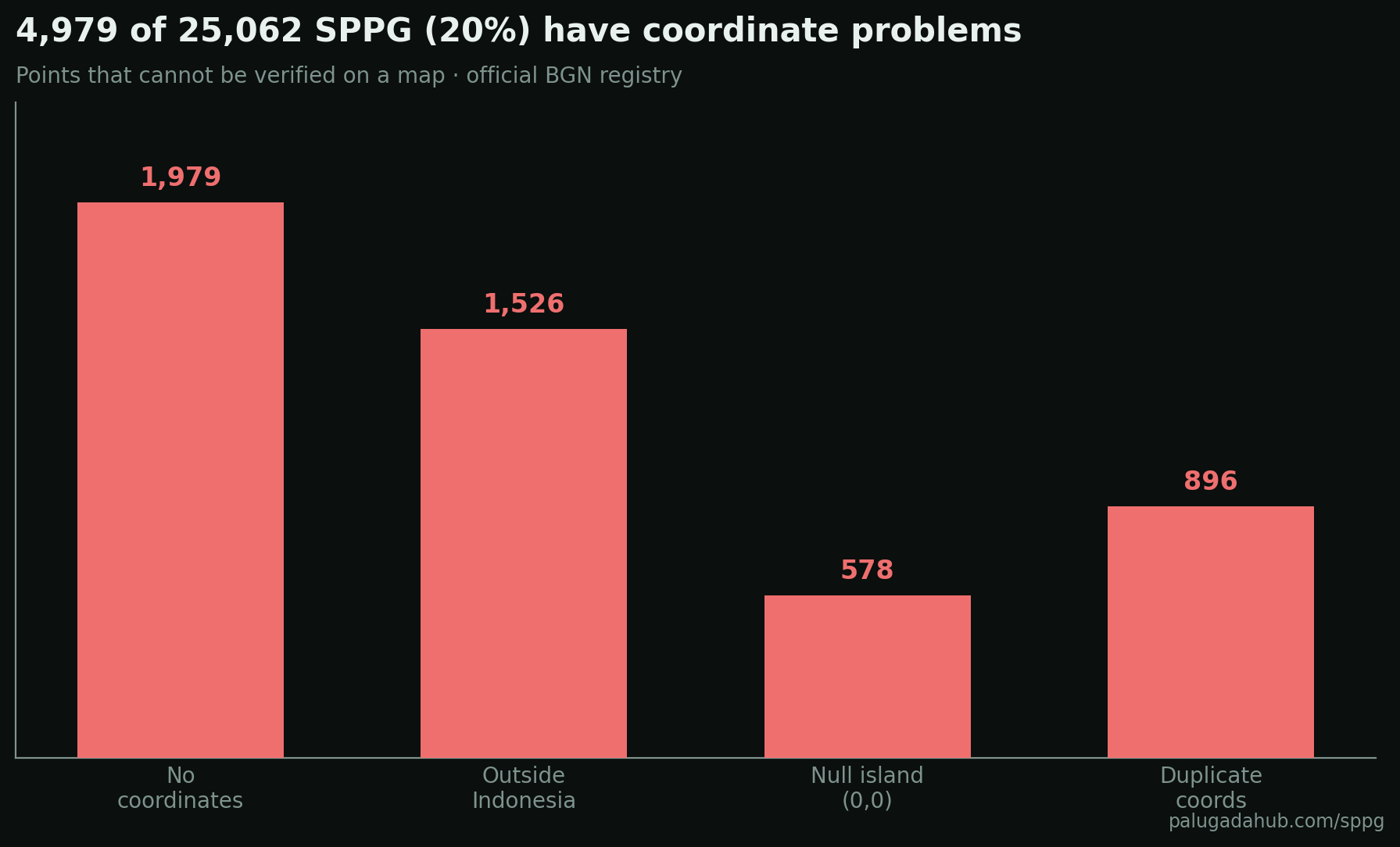
1,979 kitchens have no coordinates at all, 1,526 sit outside Indonesia's borders, 578 point to null island off the coast of Africa, and 896 share the exact coordinates of another kitchen. Roughly five thousand points cannot be verified on a map. This matters because in early 2026 a case of 100 fictitious SPPG surfaced in Cilacap, with coordinates landing in forests, rice fields, and cemeteries. Matching points against land use is exactly the kind of diagnostic that should run before funds are disbursed, not after a scandal.
The decision layer: a small DSS
A Decision Support System does not replace the human, it strengthens their judgment on a semi-structured question. The most semi-structured question around MBG is whether to become a kitchen operator. So the live tool ships a calculator. An operator puts in Rp2.5 to 6 billion of capital, BGN pays an availability fee of about Rp6 million per operating day, and the food budget runs at cost with zero margin to the operator. Return is the fee minus operating cost.
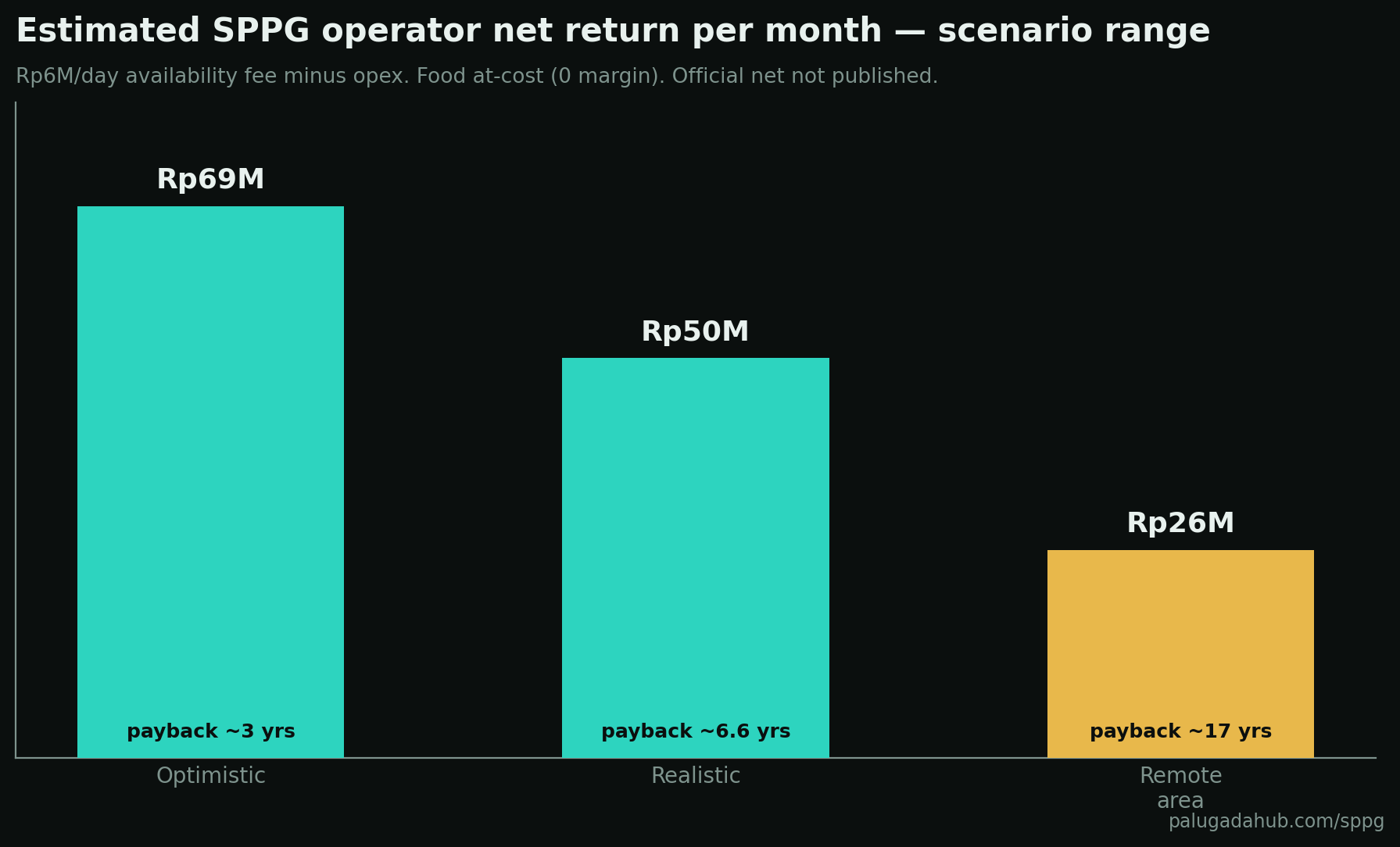
The net figure is never officially published, so the tool gives a range rather than a false precision. Realistic case lands near Rp50 million a month with payback in six to seven years; a remote kitchen can stretch past a decade. The sliders let a prospective operator plug in their own assumptions. That is the DSS principle: the model informs the decision, the person makes it.
Wisdom: predictive and prescriptive
The top of the maturity ladder, in the sense Davenport and Harris describe in Competing on Analytics, is moving past hindsight into foresight and recommendation.
Predictive, honestly stated: the rollout curve has clearly flattened since the construction pause, so the naive extrapolation of 3,000 kitchens a month no longer holds. Near-term national count is close to a ceiling, and growth will come from filling gaps, not blanket expansion.
Prescriptive, what the data argues for: prioritize the under-served east, where provinces like Highland Papua and North Kalimantan have a handful of kitchens against the hardest logistics in the country. Re-audit the five thousand kitchens with broken coordinates before anything else, because an unverifiable point is where leakage hides. And rebalance toward provinces running the highest load per kitchen.
Where this sits, and what it is missing
It is worth being honest about the maturity level. Everything above is descriptive and diagnostic, with a light touch of predictive. It is not yet a full predictive or prescriptive analytics system, and that is the point of the maturity model: knowing which rung you are on.
A few rungs are deliberately not climbed here. There is no enterprise data warehouse behind this, in either the Inmon top-down or Kimball dimensional sense, because 25,000 rows do not need one; the frameworks still apply conceptually as the province, kabupaten, and segment dimensions. There is no population-adjusted coverage yet, the genuinely missing piece, because honest per-capita coverage needs reliable BPS population per province and we would rather leave a gap than fabricate one. And a true Balanced Scorecard for the program would track four perspectives at once, financial (cost per meal), beneficiary (reach and adequacy), internal process (the coordinate integrity rate), and learning (rollout pace), which is the natural next build.
Every layer here, the map, the drill-downs, the calculator, and the integrity panel, is live and refreshes weekly from the official source at palugadahub.com/sppg.
Method note: data is pulled from BGN's public registry (gina.bgn.go.id) using non-personal fields only (name, location, status, beneficiary counts, education segments). Personal identity fields were deliberately excluded. The map uses OpenStreetMap, which is open source.
Building an AI agent?
I'm packaging how I ship them into one kit. Early access:
AI Agent Starter Kit →